Making the Model
The 3D virtual model of the pavilion was constructed from topographical and architectural information from a set of historical documents, including Gruner’s Decorations as well as archival drawings from the Royal Archives and the single extant photograph of the building. The modeling process began with scanning of site plans and building profiles from Gruner’s book, then redrawing the building outlines to scale in AutoCAD, and extruding the spaces and adding detail in Sketchup. Additionally, the research team used several software packages to enhance the model, produce illustrations, and to develop animations and virtual reality environments. The primary applications included Sketchup, Autodesk 3DS Max, Autodesk AutoCAD, Render [In], VRay, Adobe Creative Suite, Google Photosphere, and Unreal Engine. A visual orientation to the model is presented below. Process challenges and exceptions are discussed subsequently.
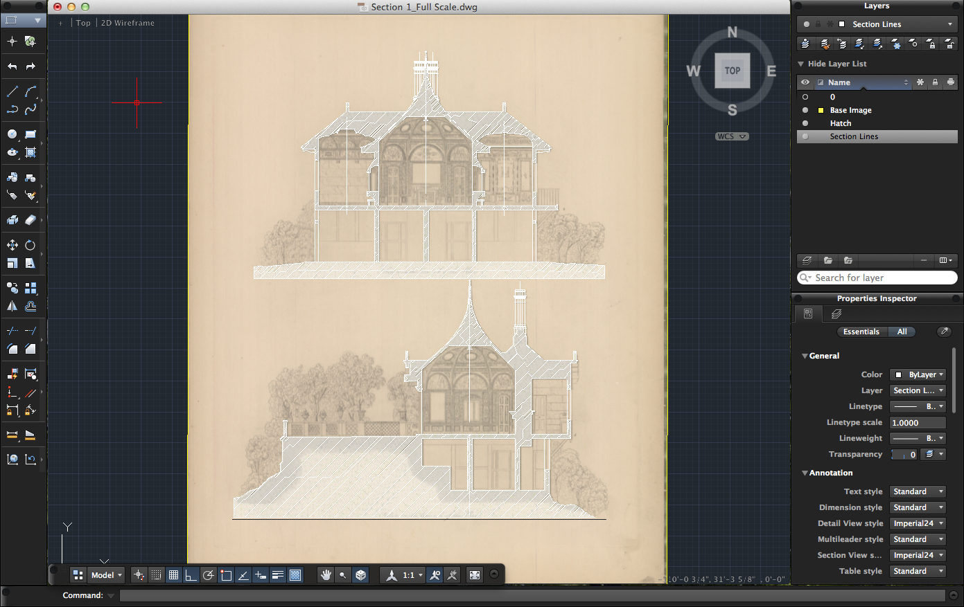
Section overlay drawings produced in AutoCad. These scaled digital drawings are derived from Ludwig Gruner’s The Decorations of the Garden-Pavilion in the Grounds of the Buckingham Palace Plate 2: Sections of the Lines a-b and c-d of the Plan.
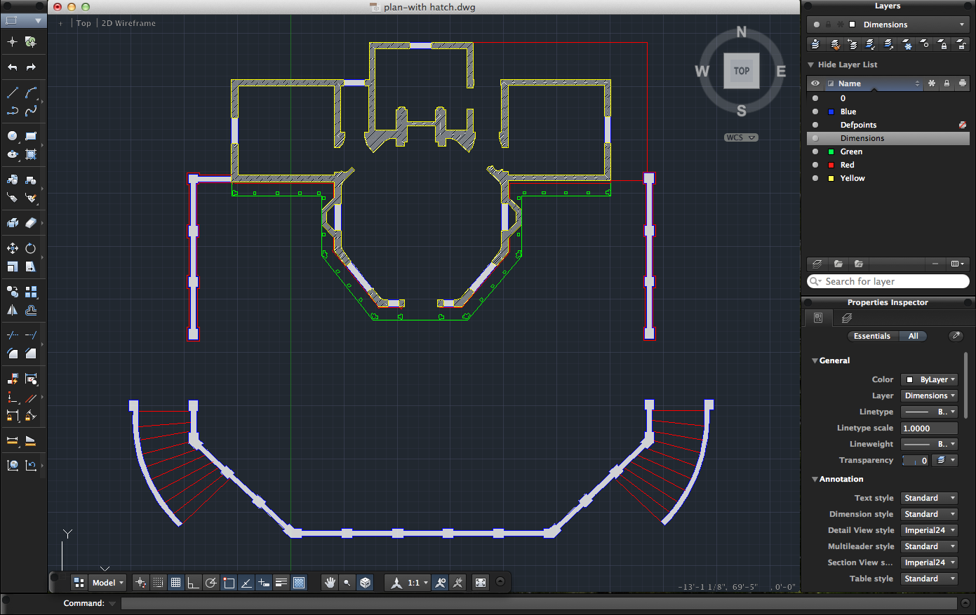
Scaled digital plan drawing based on Ludwig Gruner’s The Decorations of the Garden-Pavilion in the Grounds of the Buckingham Palace Plate 1: Plan of the Pavilion.
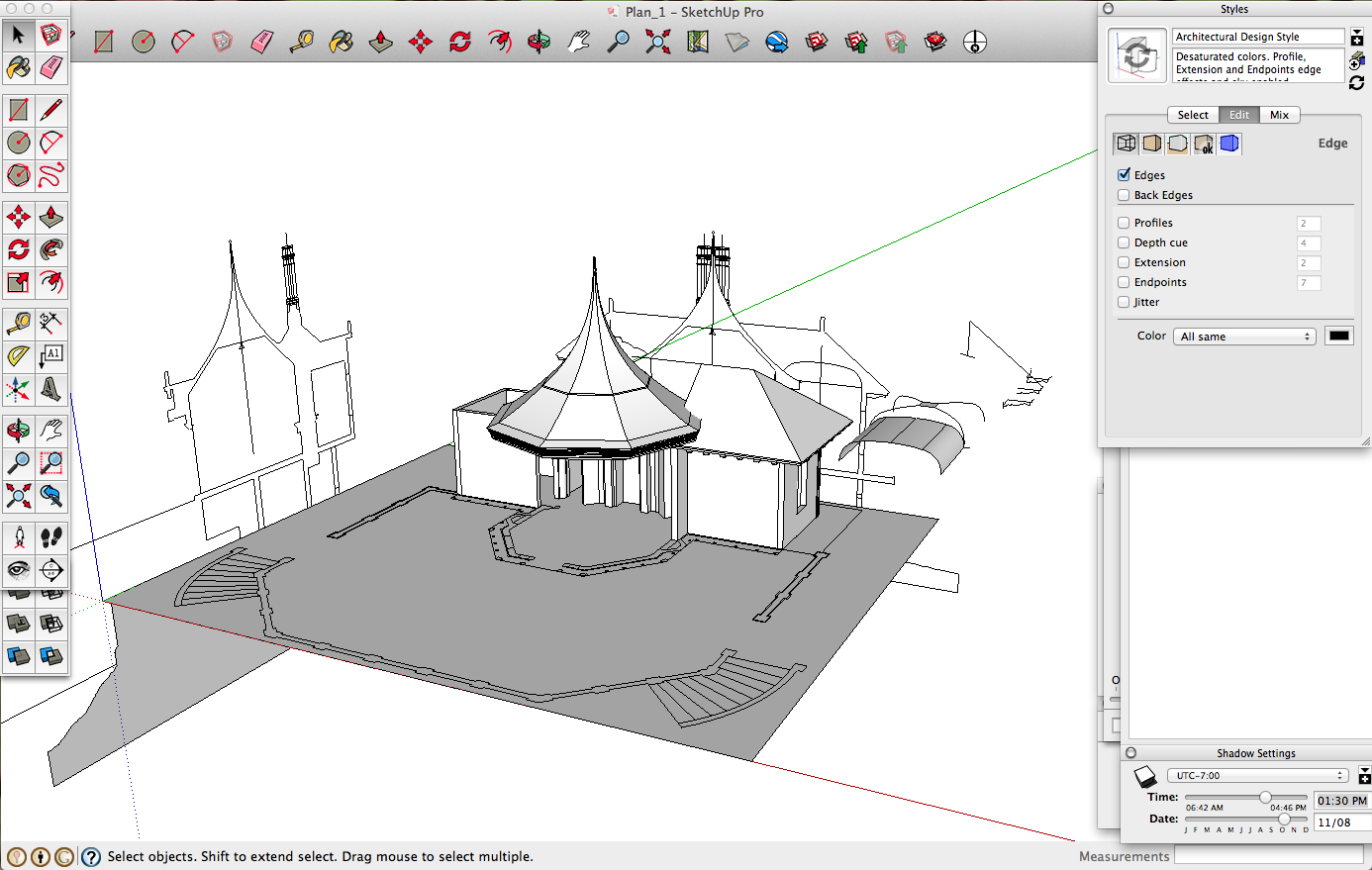
Preliminary view of the three-dimensional digital model in SketchUp. The construction is based on orthographic projections of the plan and section drawings.
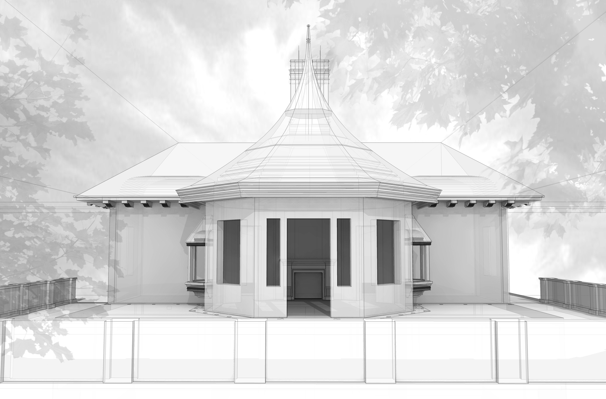
"Clay model" showing additional architectural details, light, shadow, and preliminary test of integrating the pavilion in the garden context. Rendered with the Kerkythea engine.
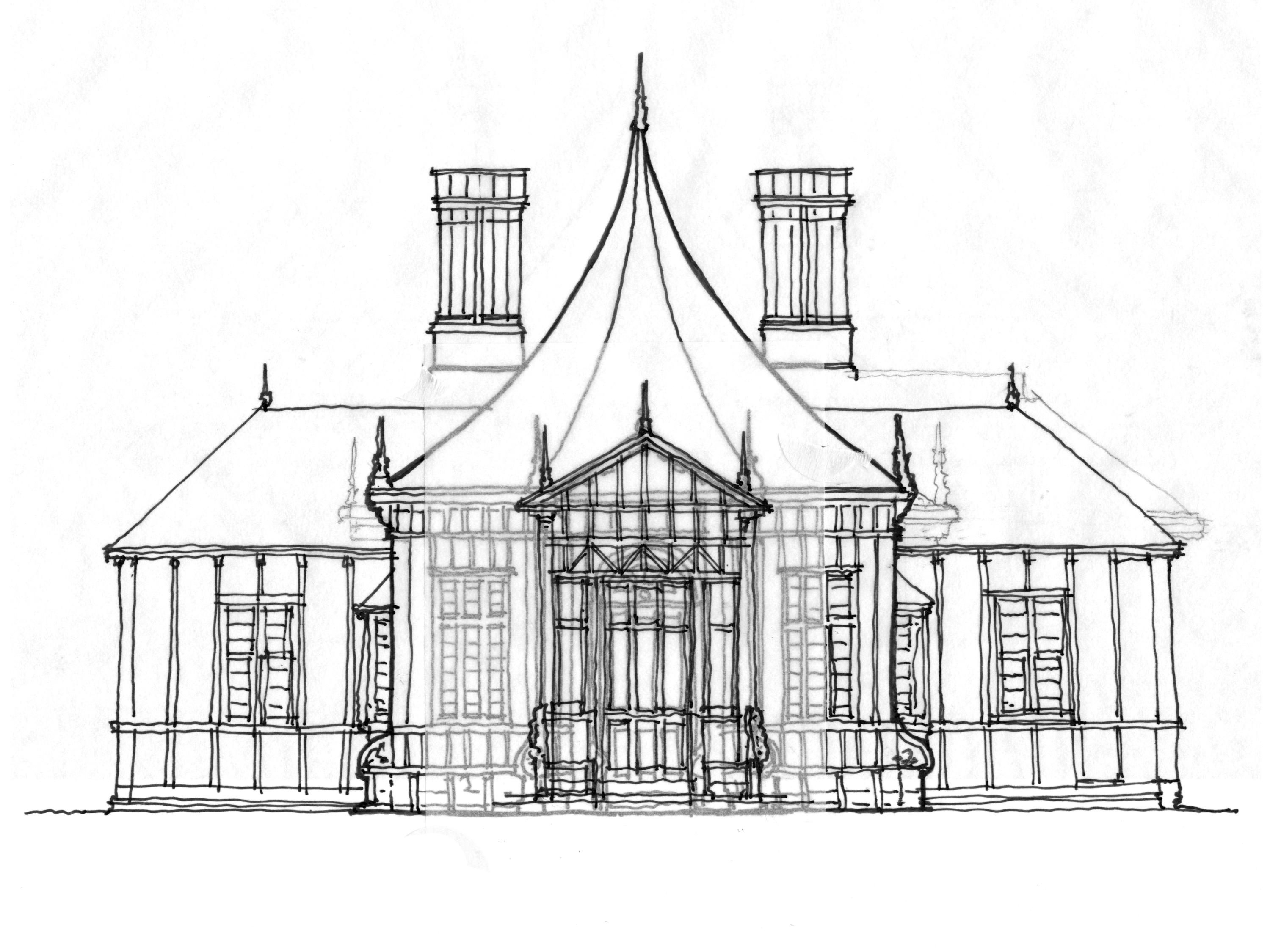
Sketches produced by the modeling team that are derived from Edward Blore’s schematic drawings for the pavilion.
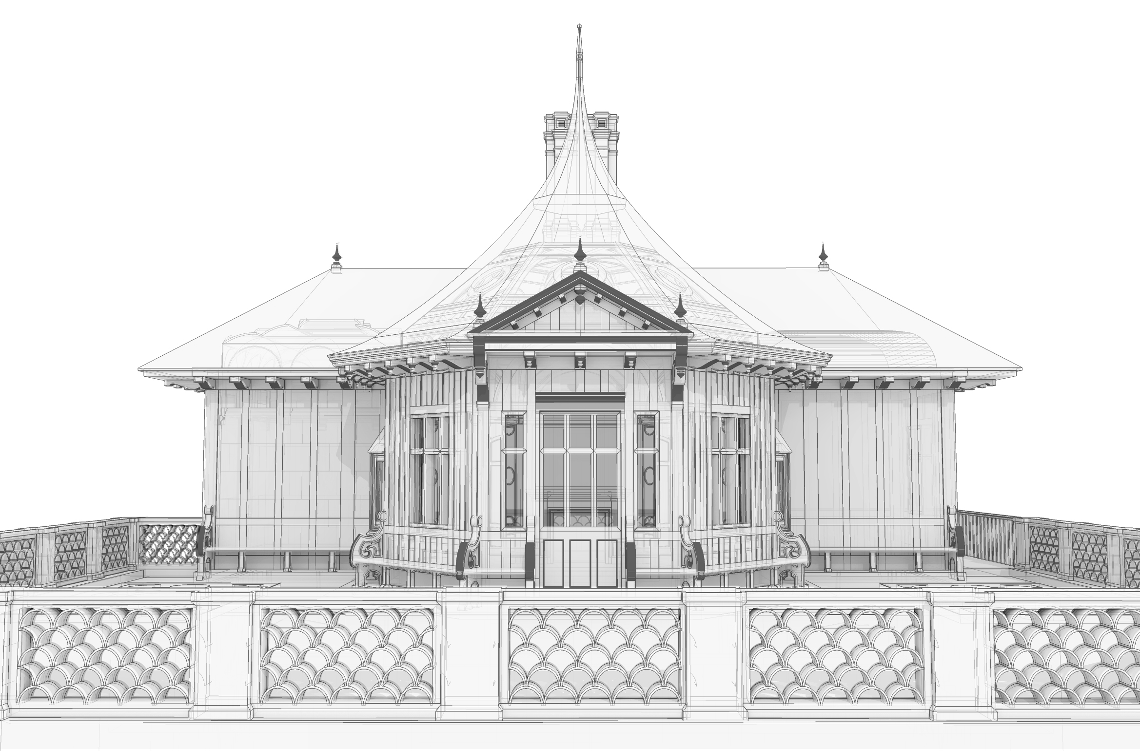
Perspective view of digital model showing the terrace, primary entrance, and architectural details.
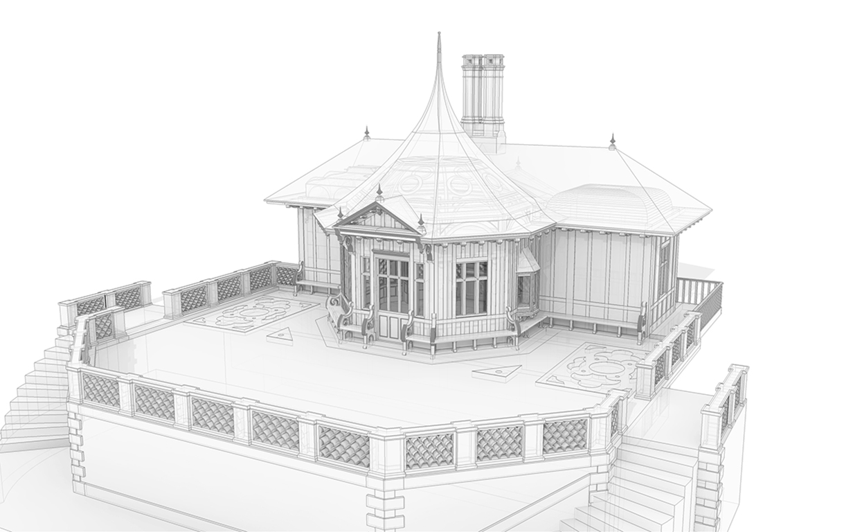
Aerial view of digital pavilion model with terrace in foreground.
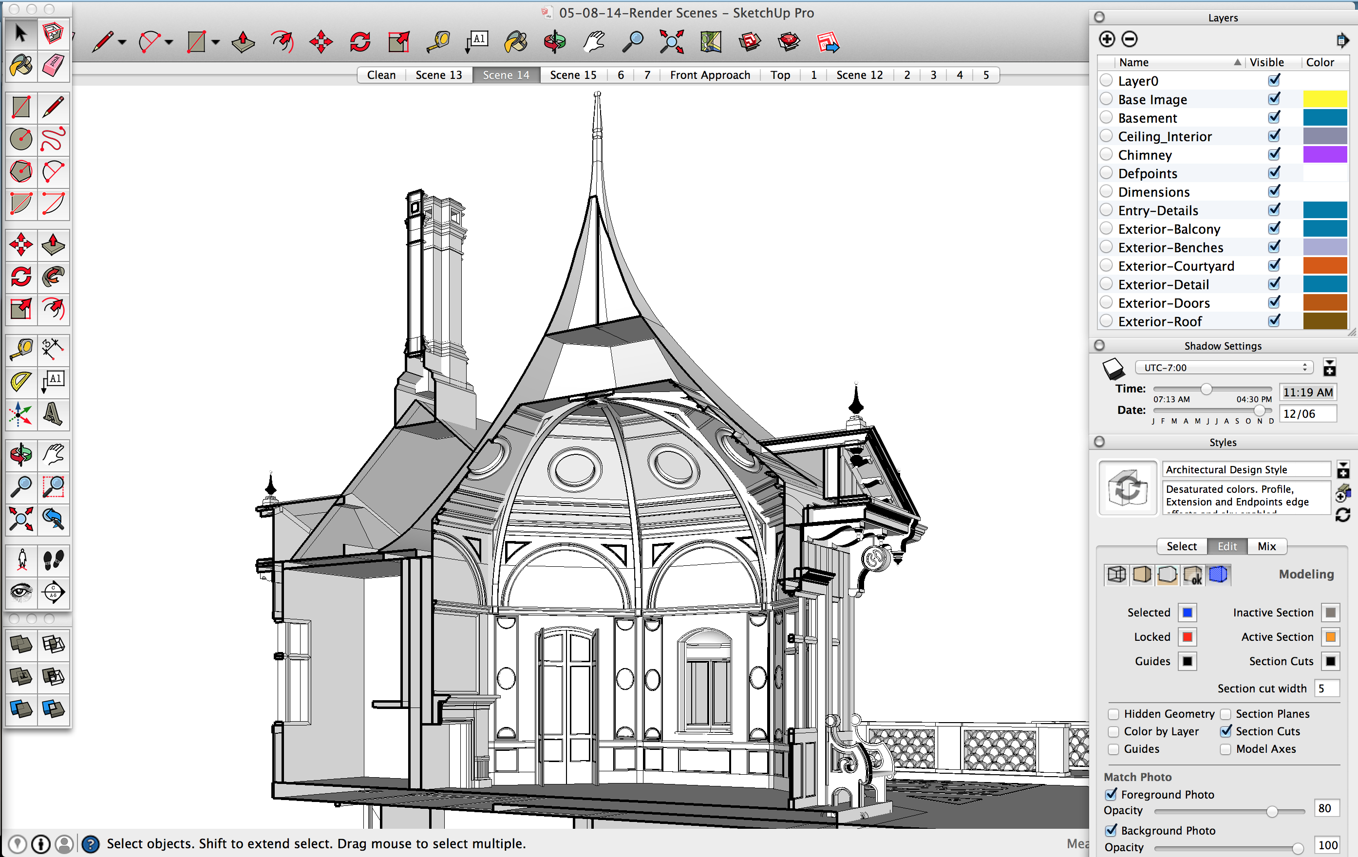
Cutaway view of the model in SketchUp. Shown here is the Octagon room and the back kitchen.
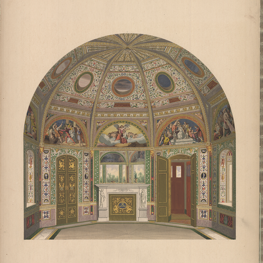
The cutaway illustration of the Octagon room from Gruner’s Decorations. Textures were extracted from the visual content of images like this one.
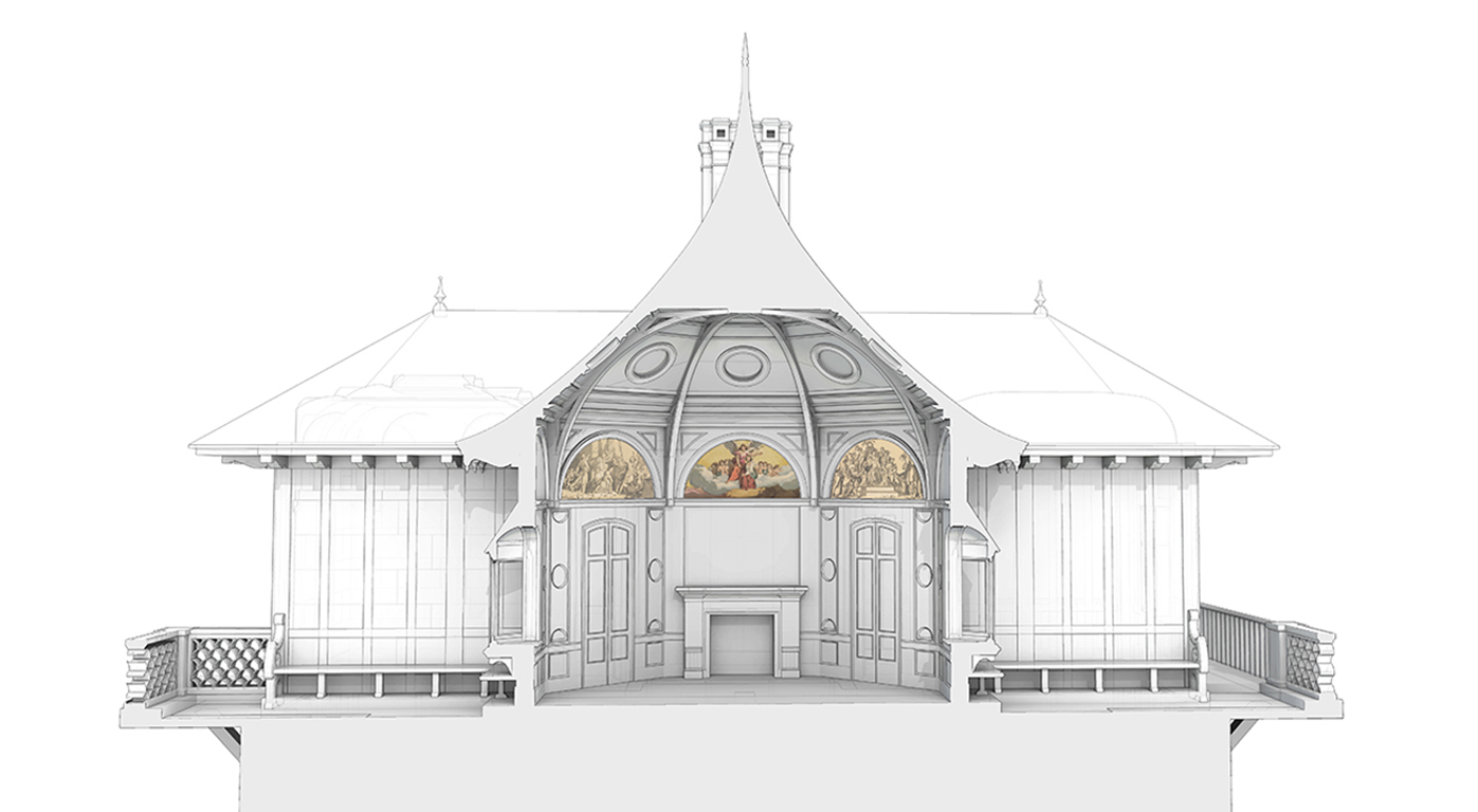
Cutaway perspective view of the Octagon Room with color lunettes applied (mapped) to the model surface.
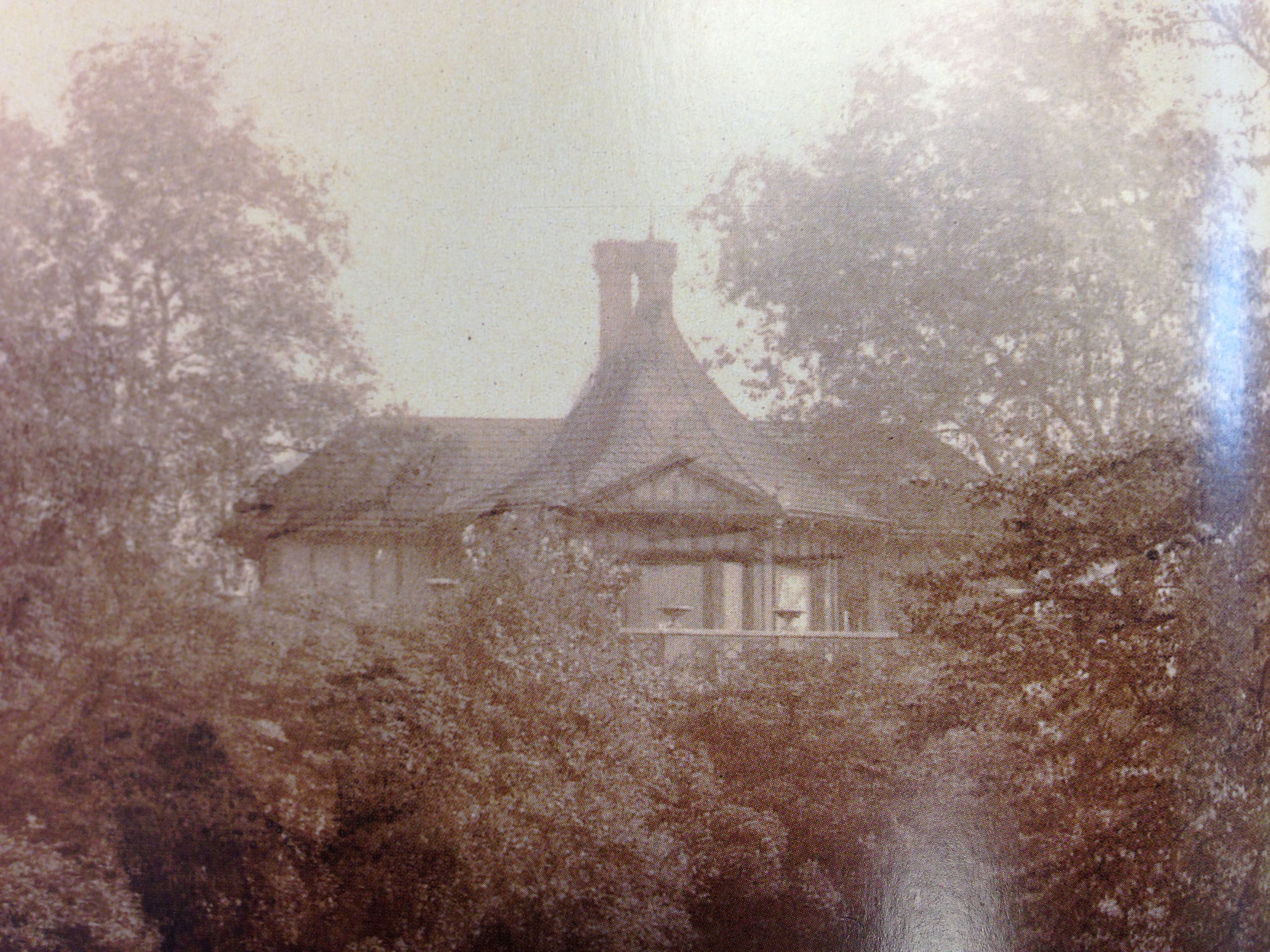
Distant photograph of the pavilion from the pond.
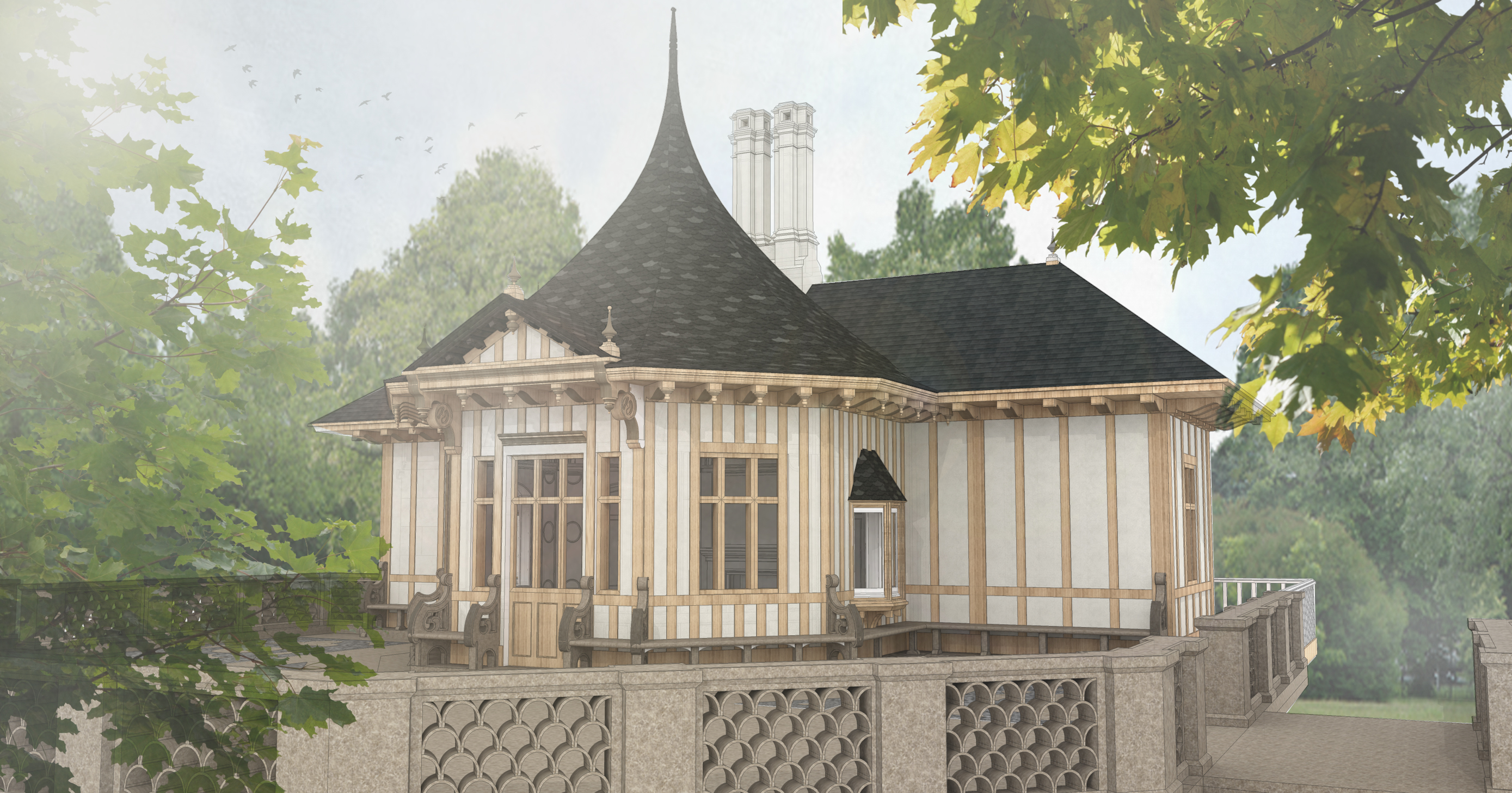
Digital model rendered to show architectural detail, material qualities, and textures.
Process and Exceptions
The team generated two model files: one of the building alone, and one which places the building in a basic topography which can then be generated in a rendering engine and completed in the post-rendering process. These files are saved as 2015 Sketchup files and can only be opened with Sketchup 2015 or later. The building model in both files has been locked so that no inadvertent changes can be made. The information contained in this process document is based upon the pro version of Sketchup and may not apply to the basic version. A free version of Sketchup Pro can be obtained from http://www.creationengine.com/ for instructors wishing to use Sketchup in their curriculum or by students at a reduced price.
The model has been created using the information contained within the folio and supplemental images. While creating the model, variations within these sources were considered along with the source and type of document. In cases where photographic evidence was available this was taken to be more accurate than paintings.
For the most part the folio paintings and documents were used to determine major characteristics of the building but variations emerge in the secondary documents. One of the major variations is the inclusion of mullions in the windows, indicated by drawings obtained from Windsor Castle and other sources. The photographic evidence and paintings in the folio do not indicate a set of mullions. These are included on a layer in the model but are excluded from the primary renderings and walkthrough.
Due to limitations with Sketchup, minor complex surfaces were removed from the model. This was due to the additional complexity (size) they can add along with the inability for the software to sufficiently model surfaces with complex curves. That challenge primarily arises in the octagonal room. The heads located below the ribs on the ceiling were removed along with the figures on the front of the mantel. Smaller complex surfaces were simulated with the available textures when possible.
In the walkthrough, the hill size was determined based upon the photograph of the pavilion and other sources. Significant variations can be seen between documents pertaining to this as some have the pavilion significantly higher than others. The hill height was estimated in relation to the pavilion’s documented size in the photograph. The hill offered a gentle slope down that would appear to be easily walkable. There was no documentation discovered to confirm the hill size.
Textures in the model were taken from the color images in the folio. In areas with limited information, textures were inferred from the patterns associated in the room. Due to the limited clarity of some of the images and incomplete texture patterns, a singular texture was used on all similar surfaces, overlooking minor variations. In the octagonal room this includes many of smaller wall textures. For example, small variations occur in the vertically oriented framed areas that contain oval and half oval patterns. The textures in these surfaces vary between instances but not all variations were available. In these cases a similar pattern was utilized in all. Other problematic areas include the oculus interior surfaces in which only one pattern was available. Lacking further visual evidence, we repeated this texture in all oculus surfaces in the model. Finally, in the octagonal room on some smaller patterned surfaces, a solid color may have been used instead of a pattern due to an incomplete texture or the quality of the texture on the surfaces. The oculus trim is an example of this in which the texture pattern could not replicate the actual shape in the model. This is due to the perspective in the available images.
In the Pompeii room, the Gruner images showed only one single usable wall texture. The project team had to decide to use a similar pattern to apply to each wall. The images in the Scott Room derive from various sources. Because of its relatively limited complexity, the Scott room offers a more accurate representation. The small lower reliefs are repeated due to the low quality of the image in the center of the rectangle and the repeated texture outside of this image. The relief image does vary between panels and a standalone image of each relief can be found in the folio but there was no clear representation of where these different reliefs appeared in space. For this reason, a single texture was utilized in all panels. The textures along the triangular areas contained images of male and female profiles. These images have unique shapes and only a few usable textures were available. A single instance was utilized for these images and repeated around the room. The wall texture in this room was created based on descriptions in the text and the images.
Outside of the main rooms the textures and colors selected were based upon descriptions, patterns found in the floor plans and sections, and other sources.
